
World Premiere 2(b): Material from Eric McLuhan’s Class on Subliminals 2
Hi there!
With Prof Eric McLuhan’s permission we continue disclosing the material related to subliminal advertising that he discussed in his class. The first part of this disclosure is available here.
Same as before, his words are in italics, my own remarks in romans.
Without further ado, the floor is his!
*
Another nice, innocent one.
All the action is, of course, in the glass, in the center two bands.
The scene is romantic: a couple stands on the beach, holding hands and observing a sunset. They are Giacometti-like stick figures, not fully depicted characters. In the distance, in the band above them, they see a square-rigged sailing ship silhouetted under full sail. Romance, nostalgia–nicely executed.
Interesting ambiguity in the copy line, don’t you think? “This country” could be anywhere the ad appears.

*
Playboy didn’t confine its naughtiness to Oui magazine: they dabbled a bit in their signature mag.

It’s the same technique as here (at the end), with one side, the centerfold, being the nude model and the other side ‘’completing’’ the centerfold subliminally. Here the centerfold is completed by a rather impressive penis penetrating the model in the guise of an airplane. The plane’s tail even provides an optical curvature.
*
Not all of the subliminals concern sex. Some, a much smaller number of course, work the other end of the life spectrum: death.
This Crown Royal ad ran for the longest time. It was everywhere, for over a year. Ad agencies have big budgets, but they are not known for throwing good money after bad, so it must have shown enduring results.
Possibly one reason is that it hands the beholder a subliminal double-whammy of symbols.

Sex and death in the same ad is a rarity: they usually occur in isolation.
All the action is in the bottom half of the page.
Sex is invoked in dozens of ways in ads; death, uses a smaller vocabulary of symbols. One of the main ones is “the hidden enemy”–silent, stealthy underwater creatures such as sharks. Coupled with the threat from the animal is the threat of drowning.
In the bottom left corner, above and left of the word “Have”: a large aquatic predator emerges from the sea (of spilled booze), jaws agape. Big enough to swallow the companion figure on the right. All we see is the head, but that is enough to prod our imaginations to fill in the rest.
To the right, a nude female beckons. Above the words “man cry?” is her torso; from waist to shoulders is clear enough. The right breast is silhouetted, and the left shoulder and arm. The head is obscured but there are vague hints of one in the place where a head ought to be found. Below the torso the legs are evident, and open. The right leg extends from tip of toe, above “Have,” to crotch, above “man.” There, we can see the beginning of the left leg, and imagine the rest.
I think the copy offers a rather strong instance of flimsiness and mere pretext, for the deeper, subliminal content offered by the broken glass and spilled liquid as a good milieu for embeds.
*
Along similar lines is this one, which you might call The Specimen.
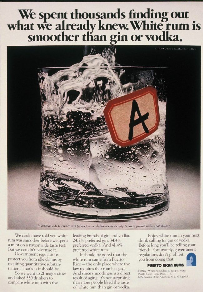
A glass of Puerto Rican Rum splashed over some ice cubes.
The colours are at the cold end of the spectrum–purple, sliver, black: nothing warm or cozy or inviting here.
The exception is dramatic, the red and beige label with the letter A on the side of the glass, which immediately suggests a laboratory instead of bar. The copy at the bottom boasts that the advertisers performed a properly “scientific” quantitative experiment concerning the rum, hence the symbolic labelled glass. The professional emotion inside a lab is supposed (by the layman) to be comparatively cold, distant, objective.
The death end of the spectrum.
Closer inspection of the glass discloses that the liquid teems with action: it is a virtual aquarium, beginning with the whale (by the tail fins) at the very bottom. In all, altogether about a half dozen fish of various sizes.
*
A roll(ed cigarette) in the hayloft
Do you remember EVE cigarettes? For a brief time, tobacco manufacturers tried marketing fags designed for fems. Another (slightly earlier) brand was Virginia Slims. Men did not, as a rule, buy or use these brands, though there was only slight difference between these and other cigarettes, other than size. Pricing was competitive with regular cigs. EVEs were introduced in the early ’70s.
This ad is rather rich in symbolism and subliminal suggestion… Let’s take a walk through it. It is nicely crafted, and not overly subtle.
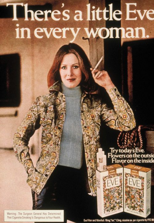
Right off, we have a woman lounging in/beside a stable–traditionally a male preserve. Leather pants–more often menswear than womenswear. (A hint of transvestism.) The hank of rope suggests a bridle–for tethering or leading a large animal. This ad is aimed specifically at women. No men here. The model is looking straight at the female reader–a direct, inviting gaze, nothing demure or hesitant about it, as if to say, “come on; try it!”
Eve–the original Eve–was daring, and a temptress. Never mind that it got her into trouble. She dared–to do forbidden things, to eat the fruit of the tree of knowledge of good and evil. This contemporary Eve is standing, leaning against a post with one leg cocked, i.e., legs somewhat apart. Self-assured, relaxed, in charge.
The headline announces that “There’s a little Eve in every woman”–a little of the daring, the feminine curiosity, the temptress, the unconventional (unconventionality was a selling point at the time).
OK so far.
“Eve” is spelled two ways. As EVE, it refers to the product; as Eve it refers to the woman in the Biblical Garden. The designers are careful to observe this distinction.
Two packs of cigarettes are shown, edge to edge, simulating a book lying open. The text there consists of a garden with Eve prominently displayed. The book, symbolically, naturally, is the Bible and it is open to Genesis and the tale of Eve in the Garden of Eden. No Adam in sight. But there are two Eves, one on the left page and one on the right, side by side in a bed of flowers… The cigarettes displayed also bear the word EVE and the signature band of flowers. The Eve posing here holds one which she has been smoking.
Note that she too is decked in flowers: her jacket mimics the pattern on the package. She and the two EVEs (and the tobacco) are simply rolling in flowers. and the copy line, an injunction, suggests another kind of roll in the hay. Be daring, unconventional… “Try today’s Eve [the woman, by the spelling]. Flowers on the outside. Flavor on the inside.”
Enough said?
*
Ads play endlessly (pun intended) with the bookends of the life spectrum in their hijinx with subliminals and symbols. To wit, death, and sex. Picking up the Garden of Eden theme and (lesbian) sex theme in the EVE ad, here’s one from the other end.
The model, made up to simulate a death mask, holds a symbolic apple in her hand (the bottle is apple-shaped). Or rather on her hand.
Hand and forearm clearly imitate a serpent.
Serpent + apple are pretty overt echo of the illicit antics in the Garden. Floral pattern on the arm suggests (Edenic) foliage.
And–death motif–the product is named Poison.
The message: take Poison–make it that special “something within you.”
There’s more, but that’s the essence.

Could there be an appeal to the murderer within the woman as well? Poison has always been the “weapon” of the frail sex. Many examples in French and Italian cultures (Naples widows &c).
Another association of ideas from this funerary scene is that of Egyptian tombs, sarcophagi, and mummies, hence of embalming and countering the effects of time, i.e., of aging. Being frozen in eternal beauty.
*
Another flower from the Garden
Here’s another bit of Garden material. In the 60s and 70s, there was a lot of concern about health and exercise, and the tobacco companies were having a rough time of it. So they all began to emphasize health in every imaginable way in their advertising. It was the dawn of the Green Era.
This ad is for Craven M cigarettes. (M for Menthol–very cool!)

The setting is Edenic, a “natural” setting with all the knobs and whistles: green foliage, flowers, a waterfall (not too large). It fairly screams HEALTHY! Clean air, cool and humid, as the copy emphasizes.
coolest…
cleanest…
most refreshing!
Even the package sports the colours white and green.
Overall impression: healthy, natural, clean.
And they boast that the cigarettes have “Just a single drop of menthol.” What could be better?
Everyone knows that cigarettes are bad for the health of the smoker. Reports of people dying from lung disease are too numerous to be ignored. Warnings were appearing on the packages.
The sinister element in the ad, the bit that connects it to death, is on the cigarette itself. Notice the print just below the filter. There is the crown logo followed by the name of the product, Craven M.
The two cigarettes have been rotated ever-so-slightly and the package tilted so that you can read only the end of the name: you see VEN.M on each of the cigarettes displayed. Venom–as in snake venom. It is pure, alright: pure poison.
And the snake is an age-old fixture of The Garden. In this case, lurking in the shadows, off-stage. And the “single drop” is displayed too…
Menthols make 32% of the market (2011), a big share, and women are 1.6 times more likely than men to smoke menthols.
Another study shows that women more than men smoke for the non-nicotine effects of tobacco such as the taste of smoke: “Compared to men, women may smoke less for nicotine and more for the non-nicotine effects of smoking like seeing and smelling tobacco or social pleasures involved in smoking rituals.” (Dr Firuza Parikh, quoted in The Times of India, July 13, 2011)
Advertisers probably deal with the product accordingly. I’d like, then, to spin a little further my yarn about poisoner women (it complements Eric’s analysis and does not negate it in the least). Venom for sale appeals to beings who undergo constant venom depletion within their bodies and need constant replenishment. The message is: Refill your venom glands with Craven M, madame.
It’s like the previous ad: ‘’Something within you is Dior’’ – when the Dior product in question is named Poison. ‘’Something within you is poison,’’ and it’s mighty precious to you!
In French (Dior’s country), ‘’une poison’’ (feminine use, while in its common usage the word is masculine) is a mean woman. In that usage it is a little antiquated, so it won’t ring a bell to the average French shopper (one has to be a little bookish), and the appeal to the meanness of one’s truest self –‘’Be yourself, la Poison!’’– is not overly obvious either.
*
Another corpse
Ok, then. Here’s another corpse to consider.
This is an ad for… Opium.
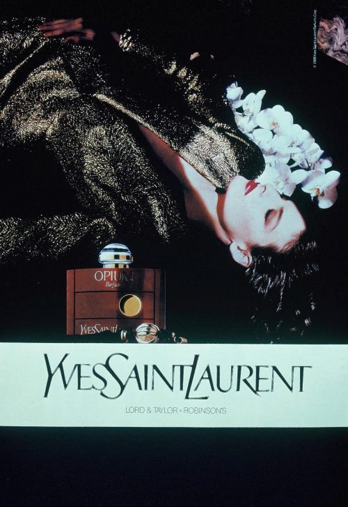
Plain and simple.
For a while, they played with the idea of the inner trip (as here, the Opium user) as a form of death.
The body is frankly corpse-like (I’ll tell you why), yet the name ‘’Opium’’ is somewhat misleading because it associates with catatonic inner trip rather than with, first thing, death.
The name ‘’Opium’’ invites you to construe the scene as depicting a woman high on a trip–in ecstasy. Yet, at the same time, your brain will not fail to register the absence of all paraphernalia associated with opium-smoking or any other intoxicating indulgence. There’s not even a pillow. It’s just a (pale) woman lying flat on her back (not crouching), and for all we know she may be lying on the naked ground. Just like a corpse after sudden, unexpected death.
And I’m sure you can poison someone with opium! Like, say, a rival: the corpse in the picture…
February 2017

As one of the ads here (Opium) is dated 1988, I asked Eric if I understood well when he told me he taught his class in the 70s. Here is his reply (email dated today): “There are two events. One was the OCA class in early 70s. The other was the carrousel I assembled to teach a class on ambiguity and subliminals at the Harris Institute, from the 90s to about 2012 or -14. Most of what I’ve been sending along is from that slide show–and I’m not done with it yet.” A clarification, then, and good news too!